Patient Monitoring Device App for TAB- Redesign
- shashanka behera
- Sep 12, 2024
- 3 min read

Patients Of Contact Health are provided with an Android Tablet to record vitals, complete surveys, receive medication reminders, and communicate with the Care Team.
Information Regarding the Application From Clients:
The client’s (CH) goal was a system Service Provider Dashboard that could assess the journey of the patient from one point in time to another. In this way, the system had to create a holistic timeline with all the vital statistics, such as blood pressure, pulse, weight, glucose, and temperature, over an observable period. The system would then map these values against a normal-value chart. If the patient data showed a variation from normal, the system would alert the remote care staff, who could then take remedial action to address the patient’s health needs.
Patients are provided with an Android Tablet to record vitals, complete surveys, receive medication reminders, and communicate with the Care Team. To record vitals, patients simply need to connect their devices (Weight Scale, Blood Pressure Cuff, Pulse Oximeter, Glucose Meters, Spirometer) to the tablet via Bluetooth and input their assigned readings for the day. These readings will then be visible on the Service Provider dashboard.

Let's Understand the Problems

Find The Problems:
Legibility Issues:
For some users, particularly those with age-related vision changes (like presbyopia), dark themes can make it harder to read text, especially if there isn't enough contrast between the text and the background. Reading light text on a dark background can cause visual fatigue.
Preference Variation:
As we talk to our Clients, Not all users( around 60%) in the 40-50 age group prefer a dark theme. Some may find it unfamiliar or uncomfortable, especially if they are used to traditional light-themed interfaces.
Simplicity and Clarity:
clutter and unnecessary elements.
Not easily recognisable icons and labels.
Small font sizes with less spacing for better readability.
Design Challenges
Balancing Simplicity and Functionality:The challenge is to create a design that is both simple enough for users to navigate easily while still offering all the necessary features and functions. Striking the right balance between minimalism and functionality is key.
Improving Readability and Accessibility: Designing for vision impairments can be challenging. The app needs to be visually appealing while maintaining accessibility standards, such as high contrast and sufficient font sizes, which may require trade-offs in terms of aesthetics.
Consistency Across Platforms: Ensuring a consistent user experience across multiple platforms while adhering to platform-specific guidelines can be a challenge.
UserFlow Diagram
Created the userFlow diagram for better understanding the flow

Color Palette
We Select This as a primary colour because of Trust & Reliability. As I Researched Blue is commonly associated with trust, reliability, and professionalism. These are critical attributes in the healthcare sector, where users need to feel confident in the information and services provided. Using blue can help convey a sense of security and stability.

Typography
We choose Inter Font because of it's highly versatile and works well across different screen sizes and resolutions, from mobile devices to desktops. This flexibility is important in healthcare applications that may be accessed on various devices by different users, such as patients, healthcare providers, or administrative staff.

Find out The Problems In Existing APP


Home Screen And Vitals Screen
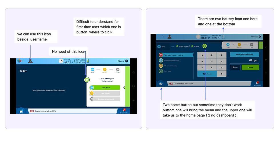

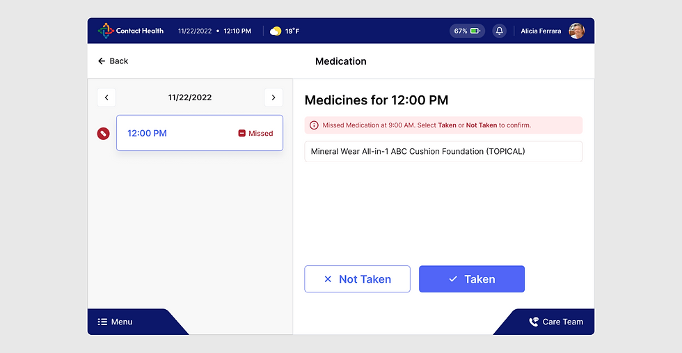
Take Vitals And Check Readings

Here we have included only the relevant actions here, not all actions in a single location. If a user needs to measure blood pressure, only the blood pressure screen will be visible to them. If a user wishes to take other vitals such as glucose, they must navigate to the home page, select the glucose tab, and proceed. It is clear that you should focus on what you want to achieve, complete it, and you're done.


Here. We attempted to design the graph in a tidy and organised manner to ensure that users can easily review the statistics.

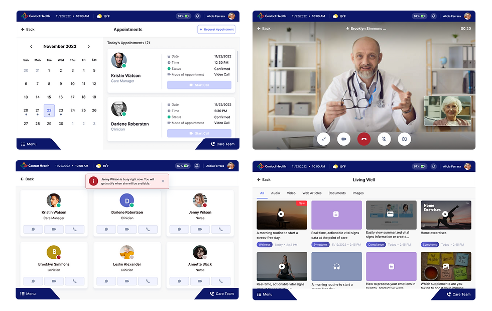
Let's check More Screen Of App

Clients FeedBack:
After several iterations, they have developed a liking for The App and are interested in moving forward with another Mobile Application designed for patients and caregivers. This will enable patients to utilize the application on their personal mobile devices by downloading it, while caregivers can also provide care for their loved ones.
Note:
1. To know about How the Service Provider Dashboard (WEB)is working please check the Link here
2. To know about How the Patient Monitoring App (MOBILE) is working please check the Link here
3. To know about How the Caregiver App (MOBILE) is working please check the Link here


Comments